
Downloads sind derzeit aus technischen Gründen nicht möglich. Bei Interesse richtet bitte eine Anfrage über das Kontaktformular
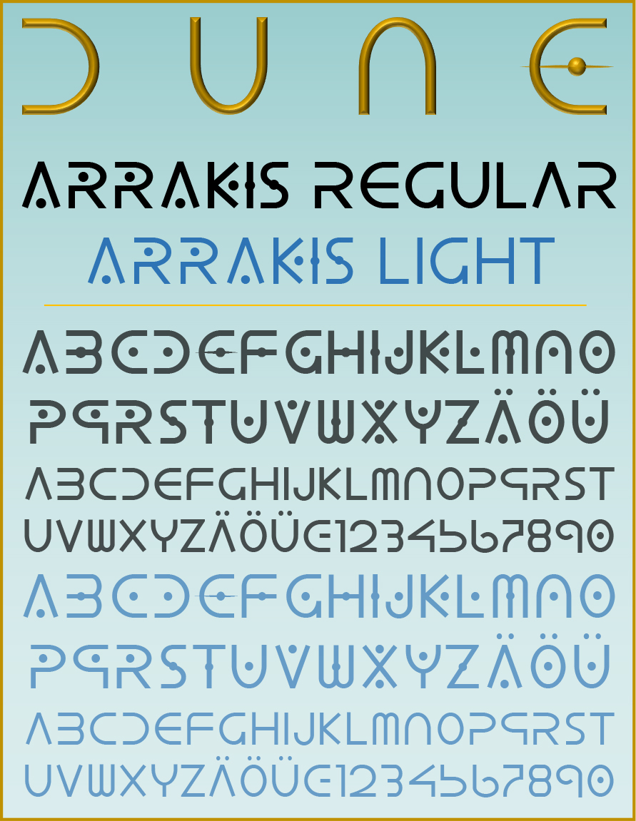
ARRAKIS is based on the title font of the 2021 film DUNE (also DUNE: Part One). Its form in turn harks back to the Canadian Aboriginal Syllabics script, which was developed in the 19th century by James Evans for the Cree, Ojibwe and other Algonquin languages of Canada. The remaining letters are meant to harmonise with the film's title font, but are otherwise my own invention, again with borrowings from the above-mentioned Native American script. This also applies to the numerals. The font is available in a Regular and a Light version. The font is more suitable for headlines and for decorative purposes and less for continuous text.
Die Schrift wurde zu meiner Zeit als aktives Mitglied im Fantasy-Club FOLLOW auch zeitweise – mit der Hand gezeichnet – als Titelschriftzug für die Zeitschriften Magira und Follow verwendet. Sie erscheint auch (in einer früheren Version) auf den Landkarten zu meinen eigenen Romanen Die Ringe der Macht (1998) und Die Herren der Zeit (2000). Die Schrift liegt in einer Regular- und einer Light-Version vor. Die Schrift eignet sich eher für Überschriften und zu dekorativen Zwecken und weniger für Fließtext.
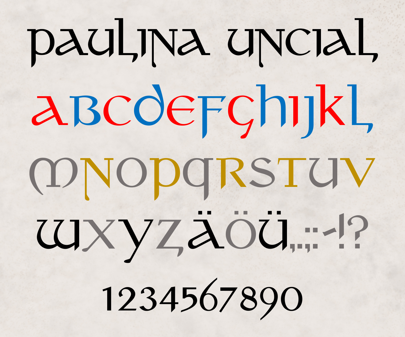
PAULINA UNCIAL is the oldest of several fonts I have designed over the years for private use. It is a semi-uncial font as it was common in book manuscripts of the 6th-8th century. The font is inspired by the maps of the English illustrator Pauline Baynes (1922-2008), which she created for J.R.R. Tolkien's novels: A Map of Middle-earth (1969, published 1970) and There and Back Again: A Map of Bilbo's Journey Through Eriador and Rhovanion (1977), both of which were published as posters in the 1970s. The map of Middle-earth, to which Tolkien himself contributed information, hangs in a golden frame on the wall of my small library.
In my time as an active member of the German fantasy club FOLLOW, the typeface was also used for a time - hand-drawn - as the title lettering for the magazines Magira and Follow. It also appears (in an earlier version) on maps to some of my own fantasy novels. The font is more suitable for headlines and for decorative purposes and less for continuous text.
In der ZIP-Datei ist der Font als TTF und OTF enthalten, darüber hinaus neben einer Zeichenübersicht auch eine Vorlage für Tastaturaufkleber (vorzugsweise für flache Tasten oder Tastaturfolien aus Silikon). Für eine korrekte Darstellung muss das Tastaturlayout auf US-Amerikanisch eingestellt sein.
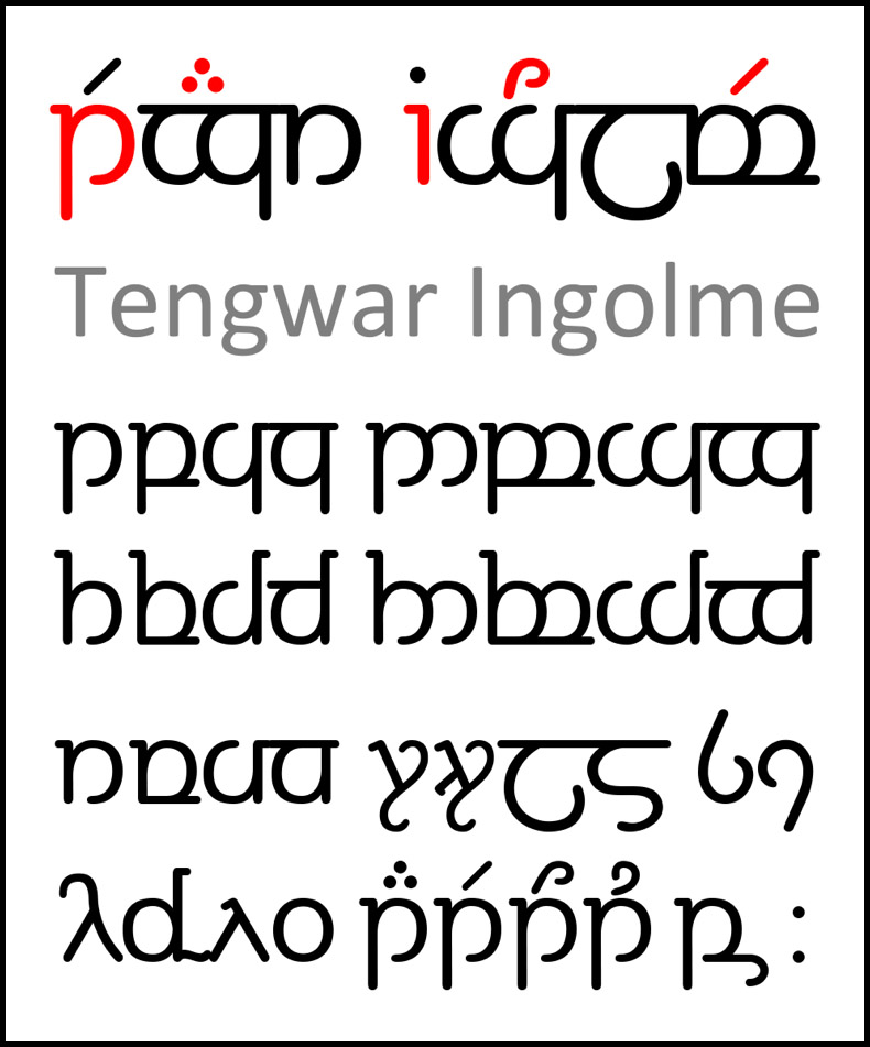
›Ingolme‹ ist das Quenya-Wort für ›Kenntnis, Lehre (von etwas), Wissenschaft‹, engl. lore.
TENGWAR INGOLME is a font I originally designed to create my own keyboard stickers for the Tengwar script. It is based on VAG Rounded in its forms, but is constructed from scratch. The aim here was to reduce Tolkien's Tengwar typeface to its basic elements - bow and stroke - and to create a font that harmonises with sans serif typefaces.The arrangement of the characters follows the system founded by David Stephen Smith, except that character no. 196 (Adieresis = Unicode 00C4) has an inverted rómen, as I need it to represent the uvular r of the German language.
The ZIP file contains the font as TTF and OTF, as well as a character overview and a template for keyboard labels (preferably for flat keys or silicone keyboard foils). For correct display, the keyboard layout must be set to US-American.
'Ingolme' is the Quenya word for 'lore, knowledge, scholarship'.
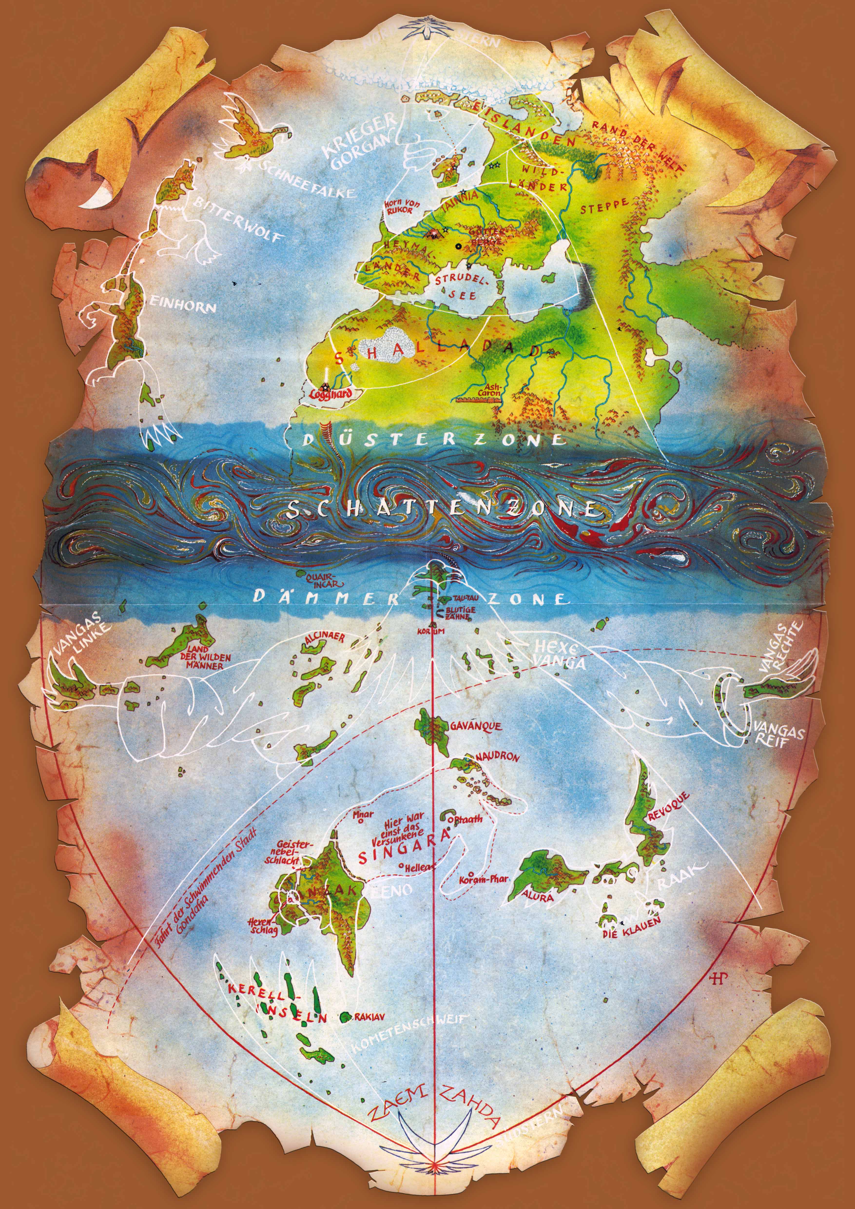
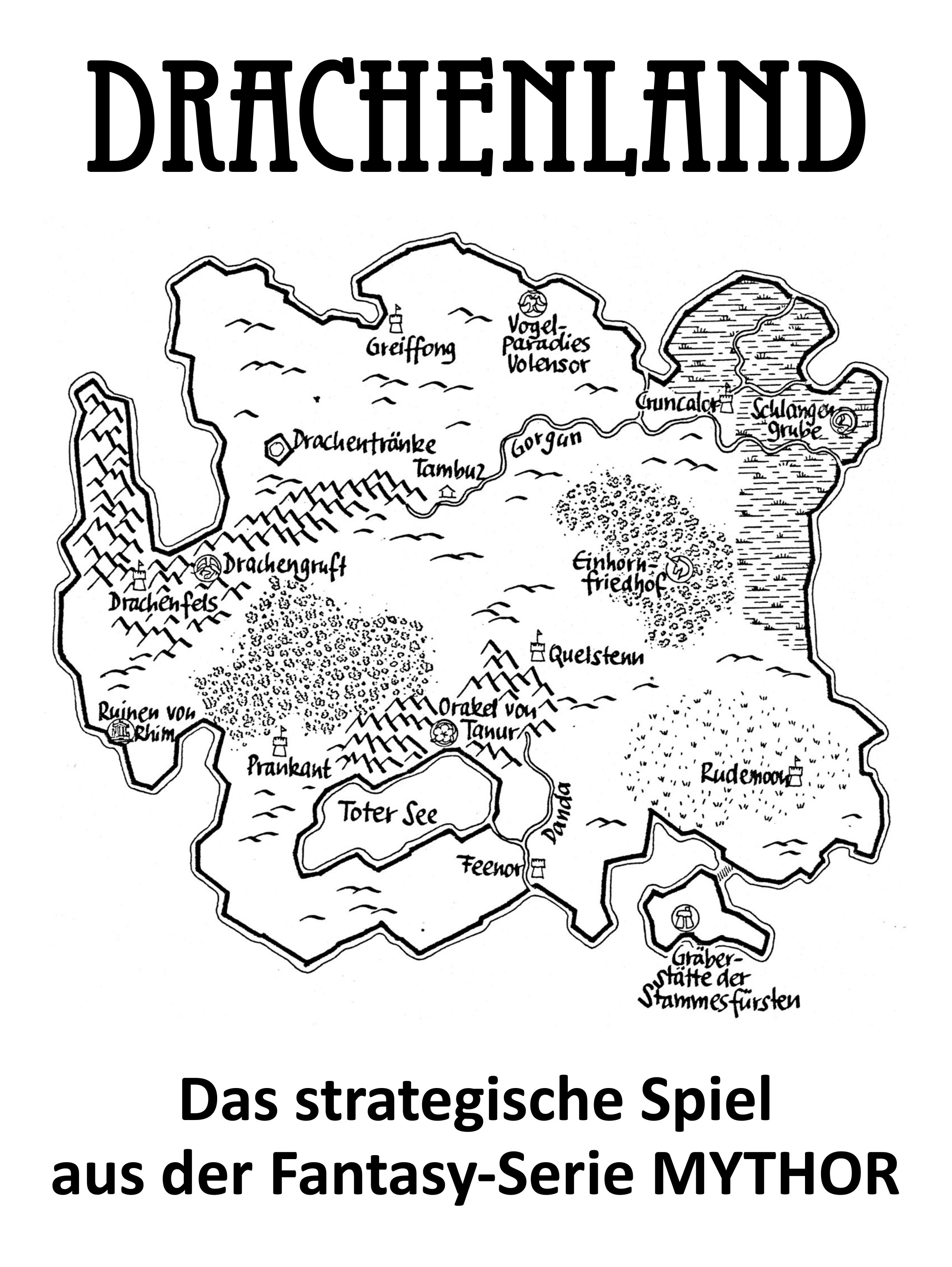
Die Serie spielt anfänglich in der nördlichen Welt »Gorgan« und geht dann durch die Düster- und Schattenzone, in der eigene physikalische Gesetze herrschen, zur südlichen Welt »Vanga«. Die Landformen fügen in der Nordhälfte ähnlich wie Sternbilder zur Gestalt des Kriegers Morgan, in der Südhälfte zur Göttin Vanga zusammen. Die Konzeption geht im Wesentlichen auf Ideen des Autors Ernst Vlcek zurück.
Es war die einzige Karte zur Serie, die in Farbe angelegt war. Sie lässt sich in vier DIN-A-4-Teilen als farbiges PDF (komprimiert als ZIP-Datei) zum persönlichen Gebrauch herunterladen.
Der Spielmechanismus ähnelt dem von CoSim-Spielen, damals populärer als heute. Dabei handelt es sich um Kriegsspiele, die aus einem gedruckten Spielplan in Form einer Karte bestanden, welche mit einem regelmäßigen Sechseckmuster überzogen war. Die Spielsteine (Counter) waren ausgestanzte Pappstücke, auf denen Einheiten als Symbole mit verschiedenen Spielwerten wie Bewegungsreichweite, etc. wiedergegeben waren. Die Themen reichten von historischen Schlachten bis zum II. Weltkrieg. SF- oder Fantasy-Szenarien waren eher die Ausnahme. Inhaltlich greift das Spiel Elemente aus dem von Hubert Straßl und Eduard Lukschandl konzipierten strategischen Fantasy-Spiel ARMAGEDDON aus den 1960er-Jahren auf, das eine der Grundlagen für den Fantasy-Club FOLLOW bildet.